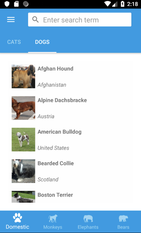
Currently, in Xamarin.Forms Shell you only can specify a header in the flyout menu. If you have a somewhat larger menu that you would like to divide in sections, then Shell doesn’t provide an out-of-the-box solution. So time to think of a solution ourselves. Let’s start with the final result. Suppose you want to have a menu like in the following image (note that I’m taking the Xaminals example app as a base for this lesson).
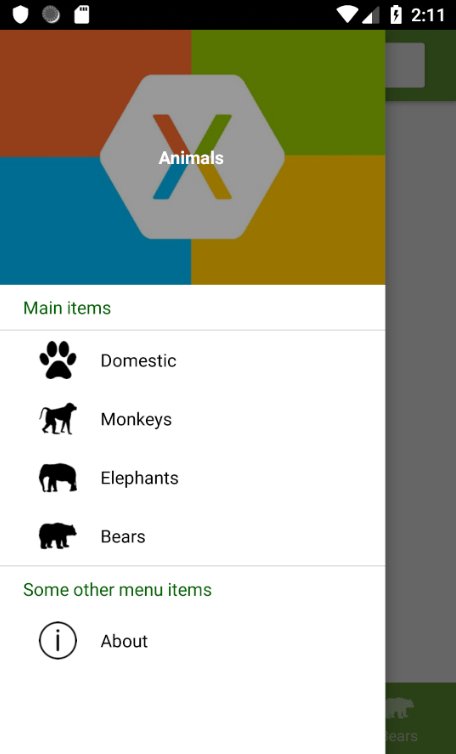
This is the Flyout section of the AppShell.xaml file from the Xaminals app. Please note that I’ve removed some irrelevant attributes for readability. I have added two header items: Main items and Some other menu items.
<!-- Header item: Main items -->
<ShellContent Route="Header1"
              Title="Main items"
              ContentTemplate="{DataTemplate views:AboutPage}" />

<FlyoutItem x:Name="shellAnimals"
            Title="Animals"
            FlyoutDisplayOptions="AsMultipleItems">

    <Tab x:Name="shellDomestic" Title="Domestic">
        <ShellContent x:Name="shellCats" Title="Cats" />
        <ShellContent x:Name="shellDogs" Title="Dogs" />
    </Tab>

    <ShellContent x:Name="shellMonkeys" Title="Monkeys" />
    <ShellContent x:Name="shellElephants" Title="Elephants" />
    <ShellContent x:Name="shellBears" Title="Bears" />

</FlyoutItem>

<!-- Header item: Some other menu items -->
<ShellContent Route="Header2"
              Title="Some other menu items"
              ContentTemplate="{DataTemplate views:AboutPage}" />

<ShellContent Route="about" Title="About" Icon="info.png" />
The ShellContent tags for the header items contain Route=”HeaderX” tags. We will need these later to determine if we’re dealing with a header item or a navigation items. Also these ShellContent tags contain a ContentTemplate tag which is mandatory. We can just set these to a random page. After all, we will make the header items non-clickable, so it won’t have any effect.
Next, we will define the template for a header item in the <Shell.Resources> section. To have total control over a regular item, we’ll also create a template for that:
<Shell.Resources>
    <ResourceDictionary>
        <DataTemplate x:Key="FlyoutItemTemplate">
            <Grid>
                <Grid.ColumnDefinitions>
                    <ColumnDefinition Width="0.25*" />
                    <ColumnDefinition Width="0.75*" />
                </Grid.ColumnDefinitions>
                <Image Grid.Column="0"
                       Source="{Binding Icon}"
                       HeightRequest="30"
                       Margin="20,8,0,8" />
                <Label Grid.Column="1"
                       Text="{Binding Title}"
                       TextColor="Black"
                       VerticalTextAlignment="Center" />
            </Grid>
        </DataTemplate>
        <DataTemplate x:Key="FlyoutHeaderTemplate">
            <StackLayout Orientation="Vertical">
                <Label HeightRequest="35"
                       Margin="20,0,0,0"
                       Text="{Binding Title}"
                       TextColor="DarkGreen"
                       VerticalTextAlignment="Center" />
            </StackLayout>
        </DataTemplate>

        <controls:FlyoutItemTemplateSelector
            x:Key="FlyoutTemplateSelector"
            NavigationHeaderTemplate="{StaticResource FlyoutHeaderTemplate}"
            NavigationItemTemplate="{StaticResource FlyoutItemTemplate}" />

        <!--
            All your other styles
        -->

    </ResourceDictionary>
</Shell.Resources>
For this to work we will make use of the Xamarin.Forms DataTemplateSelector object. So go ahead and create a custom control called FlyoutItemTemplateSelector:
public class FlyoutItemTemplateSelector : DataTemplateSelector
{
    public DataTemplate NavigationHeaderTemplate { get; set; }
    public DataTemplate NavigationItemTemplate { get; set; }


    protected override DataTemplate OnSelectTemplate(object item, BindableObject container)
    {
        if (item is ShellGroupItem && ((ShellGroupItem)item).Route.Contains("Header"))
        {
            // Make sure a header item is not clickable.
            ((ShellGroupItem)item).IsEnabled = false;
            return NavigationHeaderTemplate;
        }
        else
            return NavigationItemTemplate;
    }
}
This is where the Route=”HeaderX” comes is. When the route contains Header then we know it is a header item, so we return the NavigationHeaderTemplate. In all other cases we’re dealing with a regular flyout menu item, so we return the NavigationItemTemplate. In case of a header item, let’s also set IsEnabled to false, so nothing happens when we click the header item.
There’s just one thing left. In the main <Shell> tag, we have to set the Shell.ItemTemplate attribute to bind to the FlyoutItemTemplateSelector control. We do this like this:
<Shell xmlns="http://xamarin.com/schemas/2014/forms"
       ... All your other attributes ...
       Shell.ItemTemplate="{StaticResource FlyoutTemplateSelector}">
That’s it, here is the result again:
As you may have noticed, we had to perform some tricks to make this work. We had to set a ContentTemplate for a header item to prevent some null reference exception. We also had to define the ItemTemplate for the regular flyout items. Finally we needed to add Route=”HeaderX” attributes to identify these as header items. Xamarin.Forms Shell is fairly new so it doesn’t support header items out-of-the-box. I’m not saying this is the best solution, but it works.
If you have any additions, other/better solutions, please share them in the comments!
 Xamarin.Forms dumps